Over the summer, I have decided to go through my projects and make improvements or develop upon a few. One of these is the packaging and digital solution short industry brief we completed in the beginning of second year. We were given a couple of weeks for this project and I feel as though this project could be expanded or changed to be more relevant/ successful.
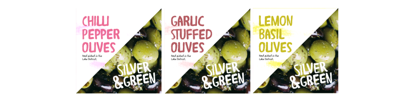
Therefore, I began by thinking about what elements of the project I liked and thought were the strongest. I then chose to develop from here and think about which sort of styles would be appropriate for the existing brand. The logo and other packaging designs for their olives use a watercolour and handmade sort of style and I felt that this could be experimented with further.
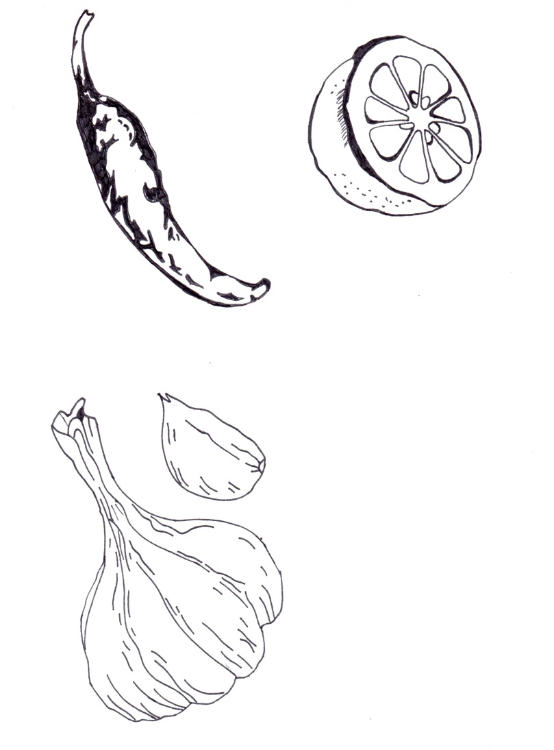
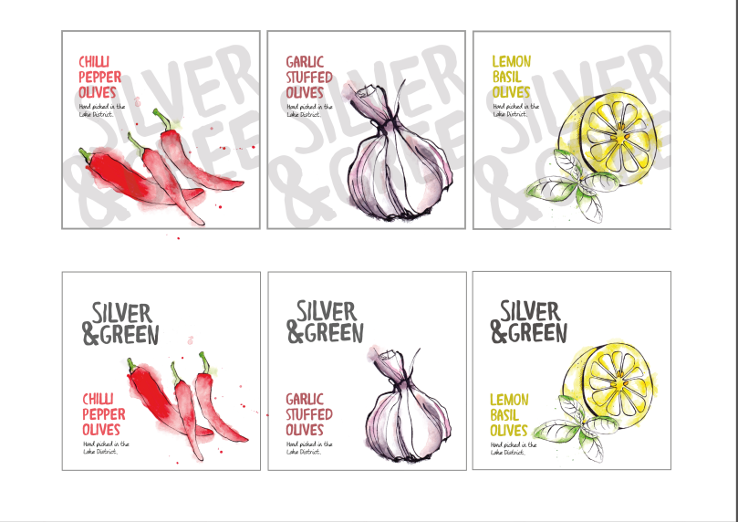
Therefore, I completed some drawings and watercolours of some of the ingredients for each of the olive flavours as I felt that this could put the attention on the product and the quality of the product.


Experimentation


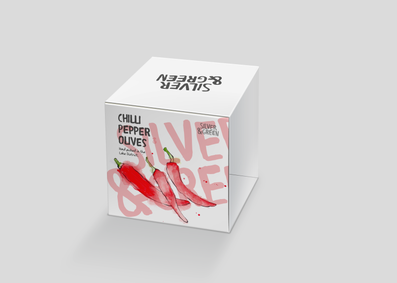
I first started sketching out some ideas using the leaf shape and square box and then developed some of these ideas. During my research, I found that being able to see the product was an influential factor for enticing the consumer to purchase or consume. Therefore, I think the packaging should retain our initial idea of using windows to see into the packaging. I looked at how cut out windows could be added to the outer packaging in the shapes of the ingredients.
![]()

I think the opening and closing mechanism was a strong part of our packaging concept to feel more organic and special to make the product seem more treasurable.
I experimented with packaging designs using the square shaped box. Part way through, a lot of focus was put on the watercolour designs and seeing through to the olives inside became lost so I began to experiment with how this could be brought into the designs again.


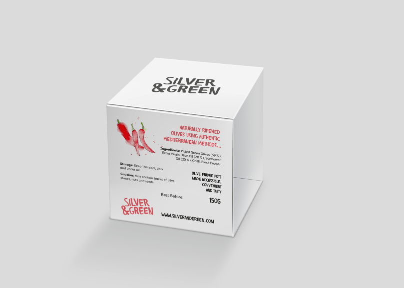
For the final packaging concept, I decided to discard the opening mechanism idea for the square box and decided to simplify the usability to be similar to existing products on the market. Therefore, I designed a wrap around sleeve to cover the round olive pot. This would also allow the potential consumer to see inside to the product which I felt was an important aspect to entice and put the focus on the fresh ingredients and quality.


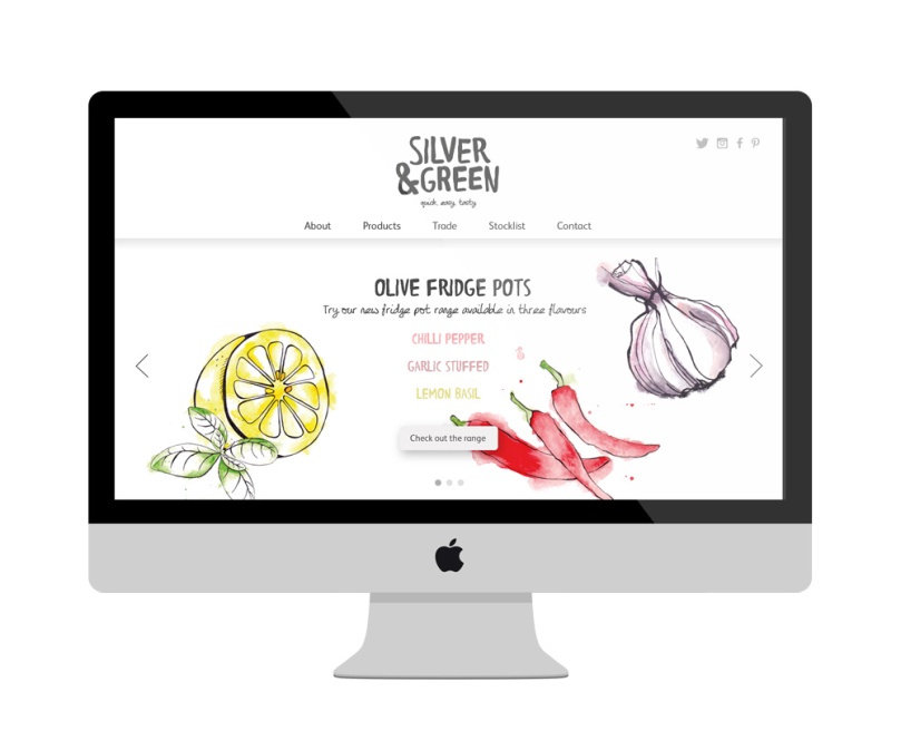
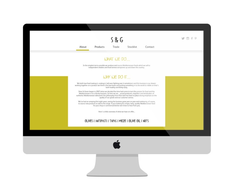
Website Design
We saw that the web design for Silver & Green was not as strong and engaging as it could be so I decided to develop upon our initial website designs and implement the new styling and packaging designs to the homepage.
I decided to add bold colour to the backgrounds of the screens in halves to give the pages impact and to create a professional and high quality feel. I also felt that as the olive flavours used colour systems, it could highlight these flavours and give that “fresh” feel.
In some areas, I wanted to add contrasting colours to give a statement look and to use Silver & Green’s photography of their produce to relate back to the freshness and quality of their products.
The nav bar would remain on the top of the screen to allow users to be able to easily navigate around the site without having to scroll back up. The use of the colour underlining on the nav bar menu would help the user to be sure which page they are currently on, which would overall help with their navigation around the site.
Options are kept minimal as it needs to be a simple site where potential customers would be searching and retaining the information they need. It is not a site where people are able to buy the product.
Sketching Concepts


Homepage Concepts Illustrator


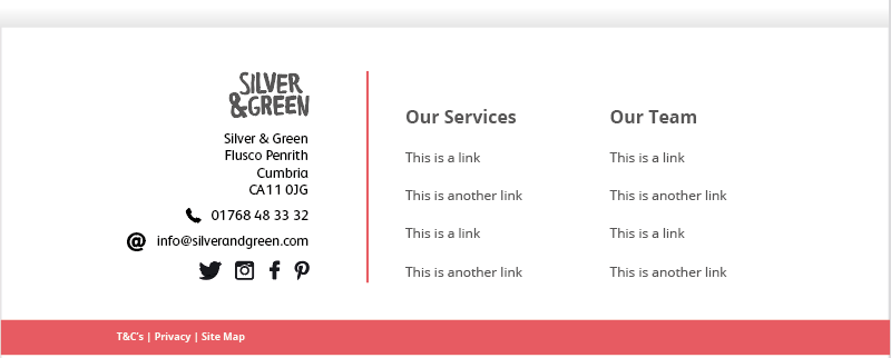
Footer Designs